To say that Spiekermann is an important player in the world of visual communication is an understatement. The designer of significant typefaces like ITC Officina and FF Meta has an impressive list of clients and awards that mark him as one of the most important graphic design players of the last fifty years. His impressive body of work has responded to a vast array of technological changes in the trade and his response to each of them is always eagerly awaited by young designers everywhere, so when Spiekermann decided that he was tired of being “pushed around by pixels” and was returning to the wonderful nuances of letterpress printing, graphic designers stopped, listened and were knocked out by the new “old” work now coming from his Berlin studio.

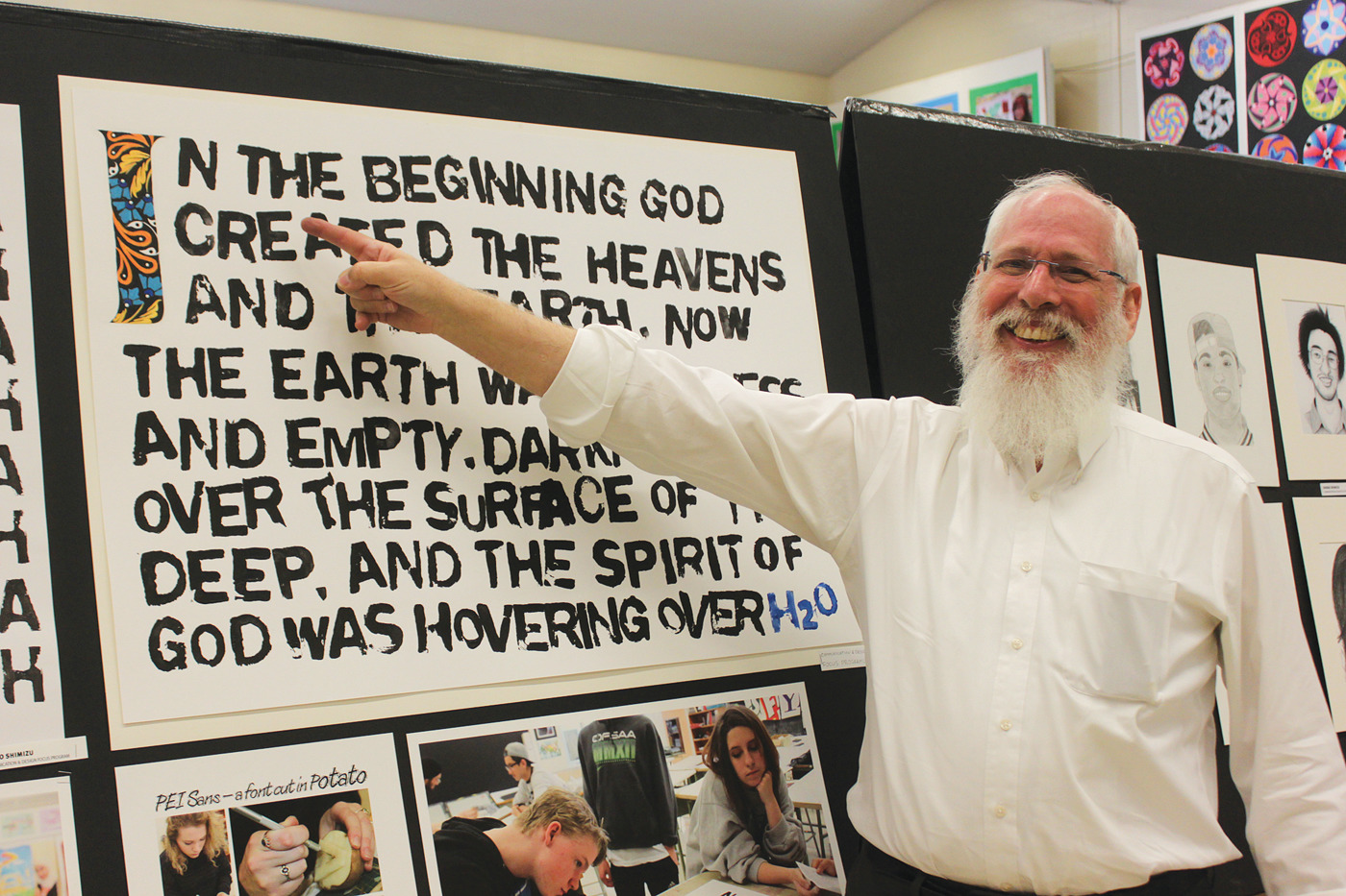
Rabbi Barry Schlesinger from Agudath Israel Congregation in Ottawa inspects the Genesis sample created by Merivale High School’s communication and design Focus Program.
After seeing Spiekermann’s wonderful Vimeo, Hello, I am Erik—The German Letterman (https://vimeo.com/99545303) I was inspired to have my students return to a more tactile typographic environment. Not having letterpress equipment demanded that I come up with an alternate solution, which I found at the grocery store—the humble potato.
I carefully picked out spuds that I felt would make the grade and distributed them to my unbelieving high school students, who were then told that we were going to take a day to create a font cut from Canadian potatoes. We were going to use these letters to print the first verses of Genesis in homage to Johannes Guttenburg.
After a short lesson on the history of type, and the relative widths of letters, a sample of ITC Franklin Condensed Bold was distributed to the students to serve as a reference. The class was instructed to cut out each letter of the alphabet, as well as the relevant punctuation. Each student was assigned a few characters and when the font was completed, the process of inking, positioning and printing each letter in succession on a large sheet of paper was started.
I carefully stepped away from the process, to observe how my charges reacted to mistakes and restarts when things did not go as planned. The messy enterprise was not quite what my students had expected, and terror stuck when they realized that their “In the beginnning” had three “n”s instead of two! They all turned to me and then realized that without the delete key they were a so used to, they had no choice but to start again, paying more attention to the constraints of the materials.
Watching my students do this was a revelation that I felt that I had to share with someone, so I decided to email Erik Spiekermann, one of my design heroes who I thought would enjoy seeing the finished product. Spiekermann is outspoken and always in demand, so I was amazed to find an email from him, encouraging me to continue in this direction with my students and to tell me how much he enjoyed me sharing this with him. He added that he was to be at the Sony Center for the Design Thinkers Conference in November, 2014, and if I was able to come, that I should touch base with him there.
My principal, Barb Gage, made it possible for me to get to Toronto, and I can say that the well-attended conference sponsored by the Association of Registered Graphic Designers was everything it was advertised to be and more. But clearly, the highlight for me was sitting in on Spiekermann’s sessions where he shared his misgivings about the erosion of typographic skills, entertained with tales of his entrepreneurial spirit and talked with enthusiasm about his return to letterpress printing.

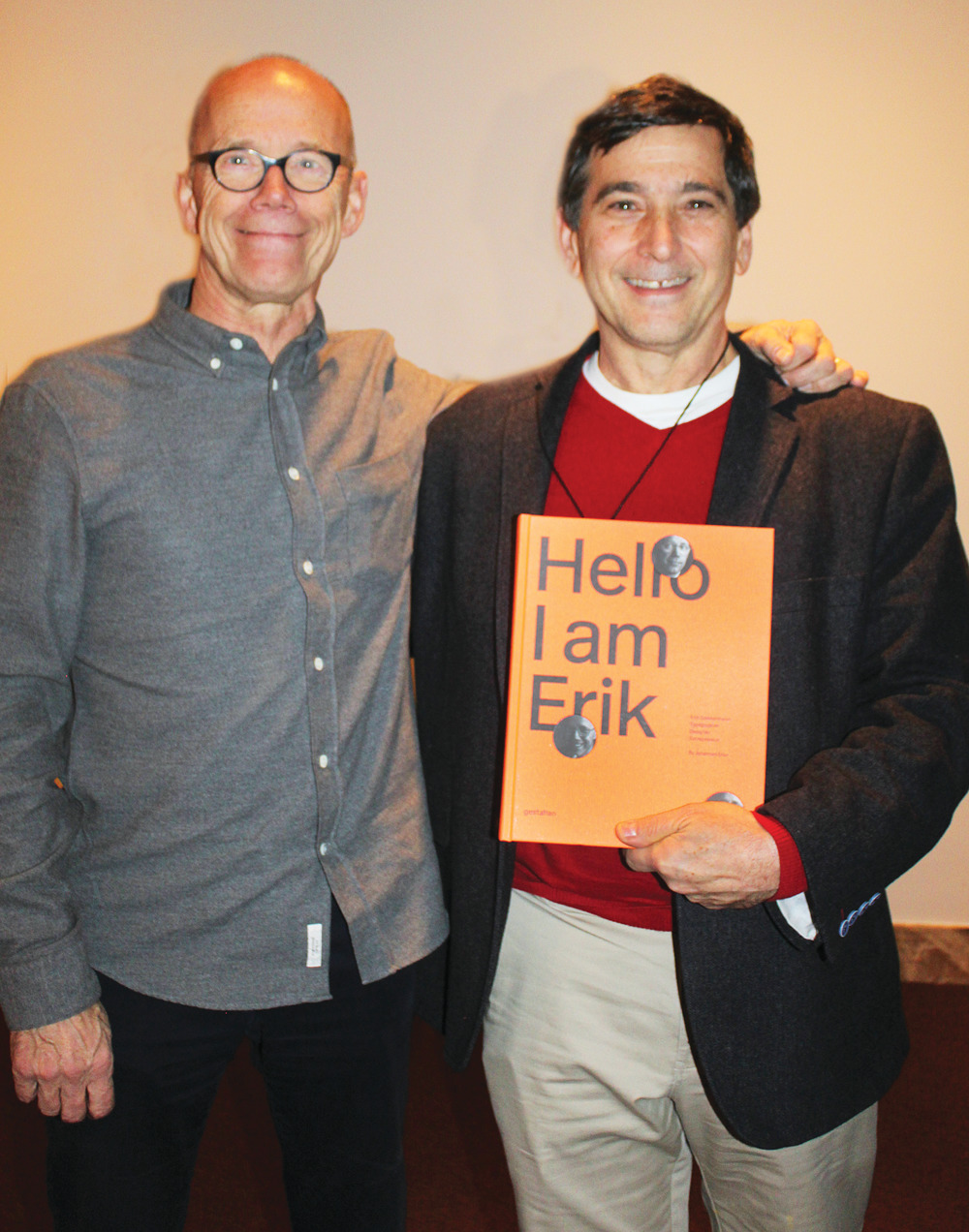
Merivale High School Fine Arts and Technology department head Irv Osterer meets internationally renowned type designer Erik Spiekermann at the Design Thinkers conference in Toronto.
To honour his considerable contribution to the field, the English edition of Hello, I am Erik was launched at the conference, and I, along with several hundred others, lined up to purchase a copy and have it endorsed by the author.
Erik was clearly the Wayne Gretsky of the design world. He took the time and effort to make conversation with his many fans, and happily posed for pictures with all of them. When my turn came, he looked up at me, saw my name tag and exclaimed, “you’re the guy from Ottawa, who was doing such great things with his students!” He then admonished me for not contacting him sooner. Needless to say, I was astonished that he would remember and told him that I knew he would be busy at the conference and that I didn’t want to bother him. He told me that I took the time to write and share with him and it would be impolite not to return the kindness. I was able to talk to him a bit about design and type. He urged me to continue with my students and to keep in touch with the work they do.
Before we parted company, he signed his book
<— Erik
—> Irv
Toronto
07/11/2014
ABOUT THE AUTHOR
Irv Osterer
Irv Osterer is a Teacher Librarian and Department Head of the Fine Arts, Computer Studies, Technology, Communication and Design FOCUS program at Merivale High School in Ottawa, ON.
This article is from Canadian Teacher Magazine’s Apr/May 2015 issue.


